Using audits to drive change, Mechanics Bank launched with a new CMS and an improved design that follows web best practices. Find out how.
Search Results
We sincerely hope you find what you are looking for. And, if not, contact us. We’d be happy to help.
Search Results List

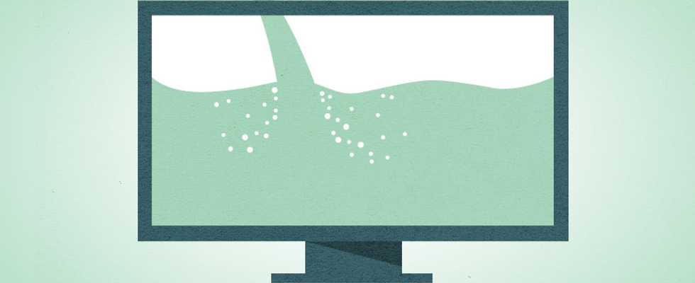
Flexibility First: Designing for Mobile and Beyond
There’s a lot more to building a mobile-friendly and responsive site than just saying the words “mobile-first” and willing it into being. What does it mean? How is it done? In this article, we take a look at the process behind designing for mobile.
The Rule of Firsts
Mobile first. Content first. Users first. Which one is really meant to be first – and what do we mean when we say “first” in the first place?

Fresh Design and Interconnected Content Model
In order to better facilitate each member’s access to relevant information, a complex content model was implemented for ease of use.

Creating a New Product: From User Flows to Prototypes
User flows helped us determine the best way to move users from one point to another, and prototypes helped confirm we were going in the right direction.
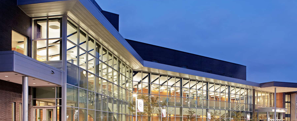
A Fresh Look for a Minnesota Institution
Updating the design for Minnesota State University Mankato in a way that didn’t remake the entire website.
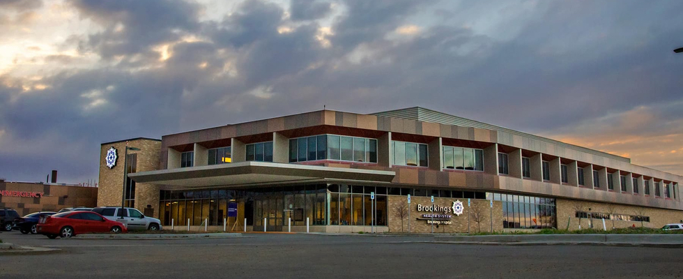
Clean Design for an Important Community Resource
The main goal of design for Brookings Health System was clear: design with wayfinding in mind, just as you would in the hospital.
Migrating to Umbraco for Internal Communication
Migrating a complex intranet build from one CMS to Umbraco, Blend developed full intranet plan from content strategy to final migration.
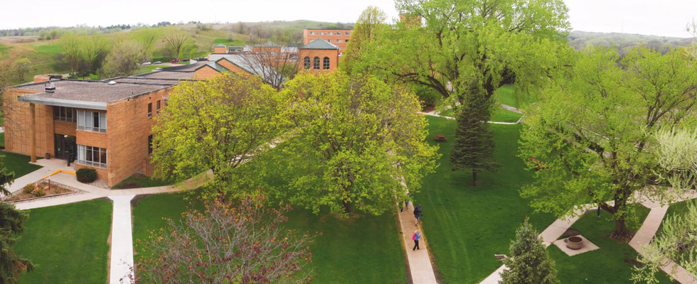
A Sense of Place for a Small University
Briar Cliff’s small stature was repositioned as a benefit for their responsive Umbraco site.
Accessibility and Videos: The Video Page Type
Providing an accessible model for viewing, understanding, and indexing videos for search.

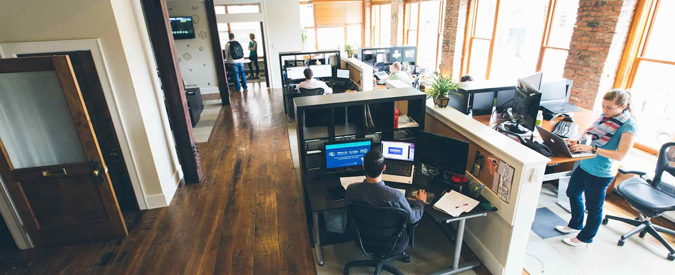
Connecting a Web of Resources
Helping connect a wide web of researchers, all while doing a bit of research for ourselves.