Using audits to drive change, Mechanics Bank launched with a new CMS and an improved design that follows web best practices. Find out how. 

Flexibility First: Designing for Mobile and Beyond

There’s a lot more to building a mobile-friendly and responsive site than just saying the words “mobile-first” and willing it into being. What does it mean? How is it done? In this article, we take a look at the process behind designing for mobile.

5/26/2022

Authored by

Categorized

  • Content and IA
  • Design and Front-End

Websites should work on mobile devices.

That’s not a controversial take. It’s table stakes, honestly. Just like making sure the URL works, or that the site is free from security issues, designing a mobile-friendly site is the bare minimum we can provide as web builders.

But, there’s a lot more to building a mobile-friendly and responsive site than just saying the words “mobile-first” and willing it into being. What does it mean? How is it done? Mobile-first is shorthand, sure, but it also means something very specific. 

More than that, it’s an entire process. Designing for mobile isn’t a task. It’s the end goal of a complex design project: and it means doing more than just making sure the logo scales correctly on an iPhone. It means thinking about the site all at once: to understand the big picture, even if that big picture is a small screen. 

So, with that, let’s take a look at the three main pillars of designing for mobile: understanding content architecture, understanding how users interact (and don’t interact) with design at mobile widths, and designing for inclusivity.

A flexible content architecture.

The idea that “form follows function” has been a part of the design world since the maxim was coined by architect Louis Sullivan in the late 1800s. It’s a call for practicality and user-centrism — to build and design things that provide the easiest path toward success.

In web design, this has always been the case — good design has sought to provide easy and logical paths toward important content. For a long time, that meant focusing on design for desktop — serving a wider user interface (and a wider audience).

Now, we no longer get to make that decision. There are hundreds of devices, from phones to tablets to laptops to refrigerators, all of which have a different screen width. The question is no longer “how wide is the screen,” but “how important is the content?”

Understanding Content Hierarchy

What this means is shifting content organization toward the mobile experience. This means creating a content hierarchy, in which we determine the importance of different content based on its importance to the user. More important things float to the top, and less important things are dropped below.

In the beginning, content hierarchy was determined at desktop widths and then rearranged for mobile devices, in a single column. This works … kind of. The location of some elements can get pretty wonky if separated from their initial context, and the awkwardness of taking items from, say, the navigation sidebar and throwing them in random spots is a front-end developers nightmare.

Now, more often, we see a “mobile-first” method, in which design begins with the mobile view and, as the site encounters wider breakpoints, the page introduces new columns and layouts. This also works … kind of. A common pitfall in this method is to shortchange the large screen layout, which leads to a simplistic "mobile-optimized" desktop experience. The content hierarchy often needs a different solution depending on how much screen real estate is available.

What we’re seeing here is that there is no one direction for mobile design, because content hierarchy is not one-dimensional: it’s two-dimensional. You introduce complexity going from wide to narrow; you lose nuance when you go from narrow to wide. In reality, content hierarchy goes both directions at once.

Navigation

Of course, there’s content beyond the page — and this is where information architecture and design come head to head. We’re used to some standard models of navigation — top level links, long lists of secondary navigation, dropdowns and flyouts, and so on.

Translating these to mobile can be tricky: do you arrange them like you might see in an app, with different “pages” of navigation? Do you pare your navigation way back and provide only the bare minimum in order to provide a better mobile experience? Are you accommodating for touch interactions that will now be click-focused? Do you use icons or words? Do you change navigation to fit the user’s context?

Like content hierarchy, navigation is also not a one-way road: it requires multi-dimensional thinking that allows for creative problem solving.

For example, a recent project had us balancing navigation between flyout at full-width and menu-style on mobile.

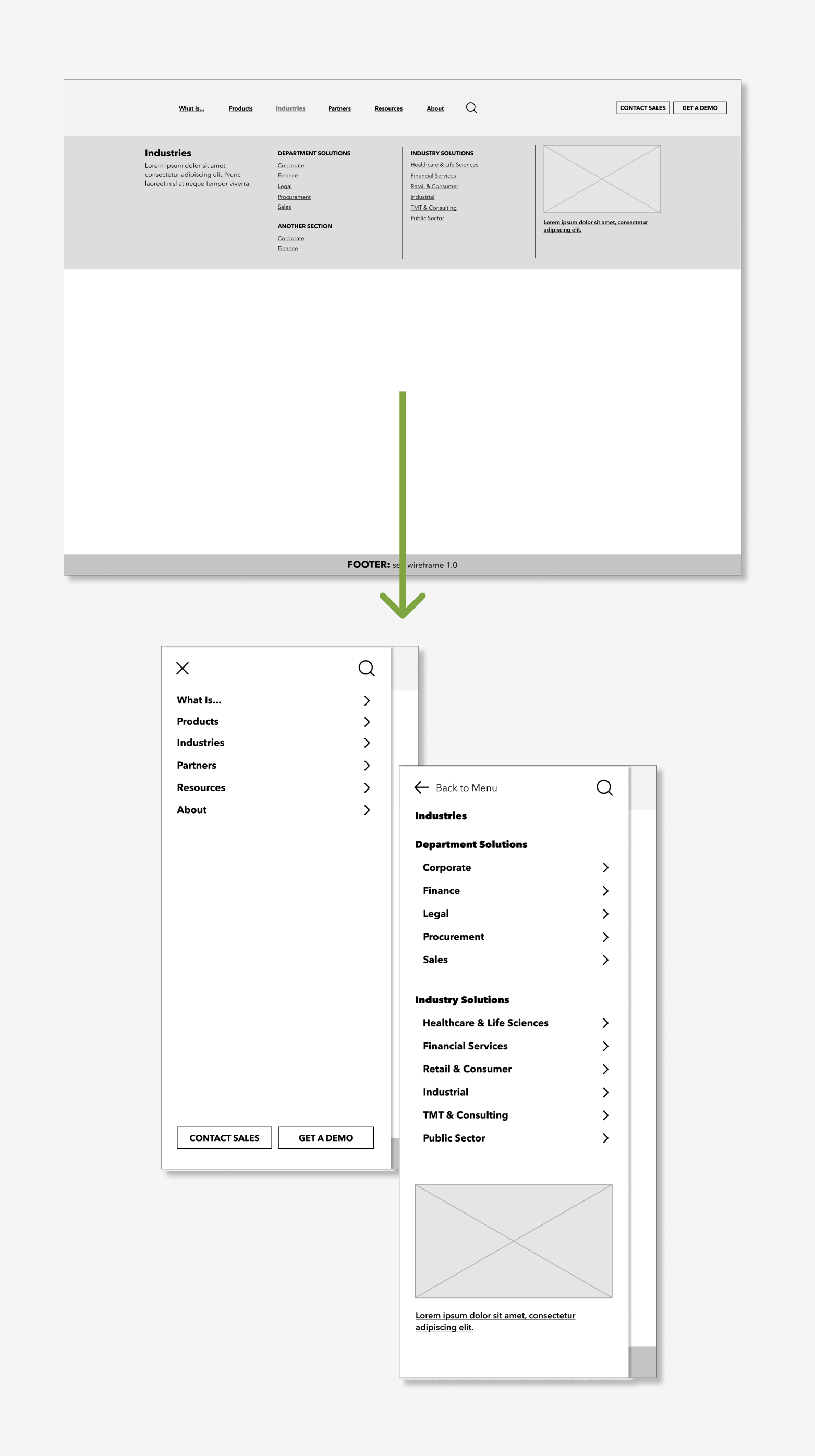
A wireframe showing how flyout navigation is adapted for mobile widths using a menu system.
For this project, flyout navigation was adapted into a kind of menu system, similar to what you might see in a standalone app, in order to use recognizable wayfinding elements without completely rearranging the navigation.

The goal becomes less about how we make flyout navigation work on mobile, and more about how moving through a menu-style navigation on mobile translates to the full desktop.

Transition to design

What’s important to gather from these considerations is that “mobile first” does not mean “mobile only.” Structuring for multiple devices is actually an exercise in “flexibility first.”

It’s not enough to just create a phone layout and then … make it bigger. Content and design are water; your browser or device is the container. It’s about understanding how content and design will adapt to the container into which it’s placed — whether that’s through a fluid layout that fills the browser window without hard breakpoints, or more traditional responsive web design that relies on breakpoint widths to adjust the overall content and design hierarchy.

An example: rate tables.

Let’s look at a quick example: creating a rate table for a banking institution. Tables (and especially more complex tables) are inherently difficult to manage at different widths. They represent one of the few design patterns that require a multi-directional spatial relationship: they are organized vertically and compared horizontally, and removing either of the two decreases the value of the table itself.

For a banking rate table, the decision then becomes whether the comparison is more important than the labels themselves. We’ve actually tackled this in two ways in a recent project for SELCO.

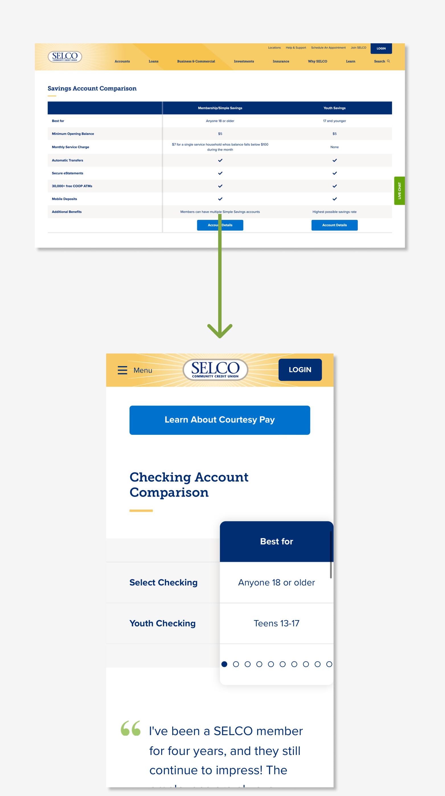
In the first example, shown below, we’ve retained the labels: the individual product is what’s important, so keeping labels and data together made the most sense.

SELCO’s account chooser, shown here in both a full-width view and a mobile view, where the mobile view has grouped each feature as a separate navigable column.
In this account chooser for SELCO, Blend arranged each feature in a column, allowing for a quick comparison between accounts.

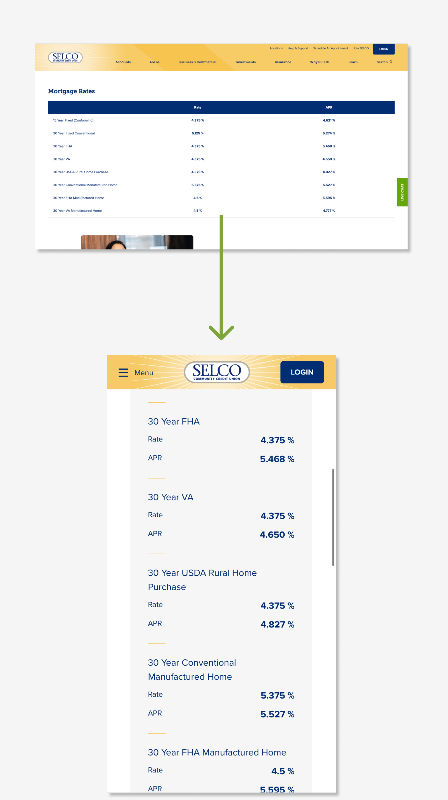
Elsewhere, where a comparison was more key, we created functionality that allowed for comparison — a more complicated front-end solution, but one that better fit the use case.

SELCO’s rates table, shown here in both a full-width view and a mobile view, where the mobile view has grouped each row as a separate item.
In this table for SELCO, Blend arranged content from each row into a kind of standalone item.

Design for mobile and beyond.

Mike Montiero, in his book You’re My Favorite Client, defines design as “how we communicate what an object does, or its function, through its shape or form.” There’s nothing about how pretty it should be, or how it should move — it’s about using visual elements or physical form to help someone make a decision or learn an idea.

On the web, these ideas are often conflated — after all, good design should be, at its core, visually pleasing. Our brains identify good design because it helps make sense of complex ideas. But what does this look like in practice?

What is — and isn’t — mobile design?

Let’s get some things out of the way. When we talk about mobile design, we aren’t talking about:

Mobile design does not assume context.

It’s easy (and a bit lazy) to make assumptions about those using a mobile device, with a picture in our minds of a busy person on a phone on their way to the store.

Someone using their phone isn’t always “on the go.” They may be looking at their phone on the couch as they watch television. They may be at dinner, following up on a conversation. They may not have any other way to access the internet. And, yes, they may be a busy person on their way to the store.

Mobile design does not mean app-forward.

While some people are relatively unfazed by app-focused sales funnels, and are happy to download an app to further a relationship, those people are in the minority. 

A market study by Heady from 2021 found that:

  • 68.5% of mobile phone users are moderately or extremely frustrated when they’re required to install an app to complete a transaction.
  • 77.9% report abandoning a transaction because they didn’t want to install a required app.

Designing for mobile means lowering (or removing!) the speedbumps that might make things frustrating. Sending them to an app will not help.

Mobile design does not mean limited features or shortened content.

Mobile design does not believe in the concept of a “full site.” There is only the site — no watered down “mobile” versions, no expanded “desktop” versions. Content should be designed to be experienced on any screen width, because we’ll never know the actual context of the user.

Balancing function and design.

With those rules in mind, we can look at the actual function of web design. More clearly, we can look at the balance between function and what we might otherwise call “graphic design.” From The Web Project Guide’s chapter on design:

While we often view our sites as a set of pages, in reality our site is a series of interaction points. Designing the user experience is about designing the pathways through these points, including:


  • Point of attention: what elements do we create and prioritize to get the attention of the site user?
  • Point of interaction: what elements signify interaction and how do we show success or failure?
  • Wayfinding: what elements help guide us to other areas beyond our initial goals, or what elements help us confirm we’re in the right place?


So the question is less about how to make something look and more about how to make something work. How can we make a touchpoint work so that a user doesn't accidentally select everything around it, while still retaining the design creativity that might be seen at desktop?

The real balance is in between, and that’s the balance itself. It’s not about mobile-first or content-first or even design-first — it’s about user-first.

An example: touch targets.

As an example, let’s take a look at touch targets. On a mobile device, our ability to interact with an element on screen is limited by a very real and physical attribute: the size of our fingers. For this reason, there are standards around how to handle the “target” we’re attempting to touch.

The balance comes from what might look aesthetically pleasing versus what might actually work with an actual human finger. A small or uniquely shaped target might look objectively better within the template, but in reality it’s completely useless if a user cannot accurately interact with the element.

Of course, there’s a balance in the other direction as well. Thinking about touchpoints with a mobile-first mind works, but also leads to some progressively basic and uninspired layouts on desktop. 

Some other things to consider with touch targets:

  • Users are less accurate with touch targets on the edges of the screen, so there’s a need not just for standards in touch sizes, but also the space between the targets and in the margins along the edges.
  • Remember that when you touch something with a finger, you're effectively obscuring that item underneath your finger. If a target is meant to convey information while touching, this finger cover-up comes into play. 

Designing for everyone.

Finally, design doesn’t end with the final Figma files. It has to be “implemented,” and that implementation requires an understanding of both user intent and front-end standards.

Because, let’s face it, you’ll never know exactly who is arriving on your site. And that means more than just “how wide is the screen.” That means creating something flexible enough that it can move fluidly from mobile device to desktop monitor to museum display.

Accessibility and Flexibility

You can research for years and never fully know the barriers your users face day-to-day, whether temporary or permanent. Which means design must assume that any barrier is on the table.

This is the basic rule of designing for accessibility: make the wild assumption that everyone has some kind of physical or cognitive barrier, and design your site accordingly. Doing so prepares the site for all comers — and at little to no cost to your design dreams. Even more, accessible design is, by nature, mobile design, because it is created for flexibility.

The good news is that designing for accessibility and flexibility is built into the natural rules of design. You can make sure text contrast is clear enough for all users without worrying about making concessions, because it’s just good design. You can use easily navigable and understandable text and images without worrying about “dumbing things down,” because it’s just good design.

Site Speed and Weight

Physical and cognitive accessibility aren’t the only factors in designing for mobile accessibility: there are also considerations around the actual machines and networks a user might be using. Not everyone is blessed with the fastest laptop or newest phone. It’s not just about screen width, but also about the device and network capabilities of someone who arrives on your site.

Some users who live in a rural area may experience slower network speeds. Some users cannot afford a top of the line internet-enabled device — or, they may depend completely on their mobile device, with no access to a desktop or laptop. Which means you’ll need to make sure you’re planning for slower devices — and slower network speeds — in your front-end design.

Some of this happens at the graphic design level: for example, keeping large visual assets to a reasonable level, or designing with fewer complex animations or interactions. Beyond that, we’re talking about basic usability.

This means understanding:

  • Which image and file types will provide less weight.
  • How to restrain animations to those that clarify and reinforce interactions, rather than adding flourishes that get in the way.
  • How to optimize animations to work smoothly on lower-end devices..
  • When to rely on caching to prevent reloading assets over and over again.
  • Whether large images or heavy files and interactions should be loaded when requested, rather than on default.

These aren’t just important because they make the experience better — search engines like Google take overall page speed into account within their algorithm, making a fast and clean site search engine optimized.

A few final words.

One article will never capture the nuance that goes into designing for mobile devices — every project is different, and there is simply too much complexity within each project.

However, we hope that this has highlighted the thought process that goes into designing for mobile. It’s more than just smashing things into a smaller container, and it goes much farther than how we manage images and rearrange navigation.

You don’t get a say in how someone views your website. What you do have a say in is the experience they get when they arrive. Thankfully, a decade-plus of design research, practice, and standards have set us all up for success. It allows us, with confidence, to build things so that, no matter who you are, and how you arrive, you’re ensured the ability to interact and communicate with our website.