Blend has a new CMS partner! Check out all the details on our newest supported platform.
An Interactive Map for the Interactive World
The world of digital and web companies made clickable, the Points of Control map provided a fitting backdrop for the industry’s visionaries.
Client
Not every project ends up featured at a multi-national web conference. But when a project does, you had better make sure it looks great.
And thanks to the talents of lead designer Sam Otis and the rest of the Blend team, we made sure the Points of Control Map at Web 2.0 Summit looked better than great.
About Points of Control.
The Web 2.0 Summit was a gathering of the industry’s influence-makers, co-produced by the folks at O’Reilly and UBM, focusing on conversations about the direction — and future — of the Internet Economy. The speaker list included everyone from will.i.am to @ev to some guy named Mark Zuckerberg.
The theme for the 2010 Web 2.0 Summit was “Points of Control,” an in-depth look at how the industry is continuously driven by competition and conflict between the Web’s major players. “Points of Control: The Battle for Network Economy,” would pit the world’s web powers — from major names like Amazon and Apple to relative newcomers like Quora and Zynga — in a battle for acquisition, and it was going to take form as an interactive map on the Web 2.0 Summit conference site.
The project.
The Web 2.0 Summit Map was designed to serve two goals: to provide a flashy, buzz-producing site for the conference, and to help drive registration and media attention.
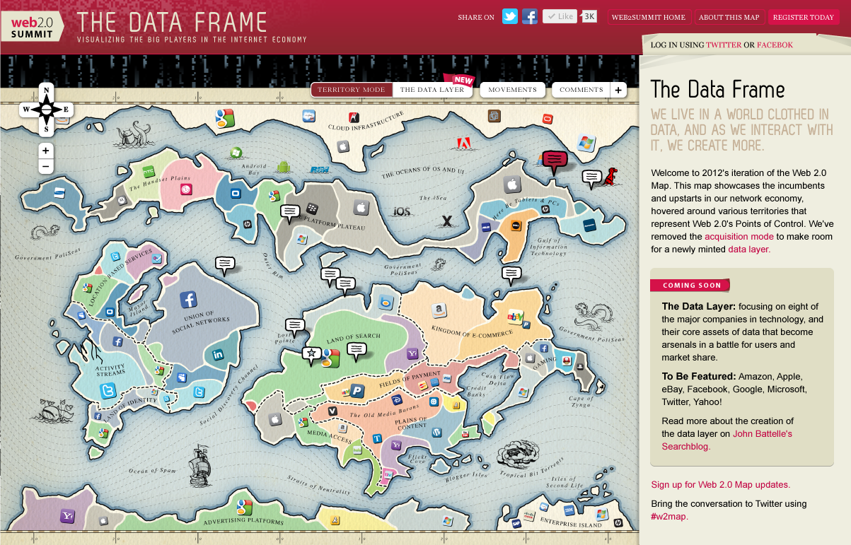
The two iterations of map design began as a brainstorm. Searching for an effective way to visualize the constantly shifting power struggle in various web industries, Battelle and Blend landed on the concept of an old-world discovery map — one part Risk, one part "Here Be Dragons."
The map itself was developed using Google Maps’ existing framework. Functionality for the first iteration included the ability to comment on each company, suggest possible acquisitions and mergers (the most popular of which were tallied in a leaderboard) and a second stage that presented each company's advancement and movements into new fields.
Into the Data Frame
The success of the “Points of Control” map led Battelle to take it one step further for 2011, unveiling “The Data Frame”: a collection of Sim City-like communities that help visualize the power — and value — of the data collected on the Web. This data, pulled from Neilsen, allowed users to compare different web companies, while a city builder function helped fill the holes in the map's choice of web properties.
For the second iteration, a new question represented itself: how do you effectively show data using last year’s map format? While adding the Data Layer meant developing a custom interface for both existing and user-generated cities, it also meant we had a new challenge: combining the original map's aesthetic with the new frame’s functionality.
The results.
The first iteration of the Web 2.0 Summit Map launched at the end of August 2010, about three months before the conference in November. It saw over 80,000 unique visitors in the nearly three months between launch and the end of the conference, with spikes of up to 8,000 per day.
An additional 25,000 new visitors pulled up the second iteration of the map, launched September 2011 and culminating during that year's conference in October.
Overall, 125,000 unique visitors have interacted with the map. The map served as the backdrop for both summits.
Project results.
- A fully-interactive map of web properties designed from scratch and built on top of Google Maps
- Custom design by Blend’s own Sam Otis
- A second iteration of information allowing for comments and other data
Related work.
View projects similar to this one.

A Google Maps Overlay to Help Visualize Territories
Diving deep into the Google Maps API to deliver some county-by-county and ZIP-by-ZIP boundaries for each sales territory.

A Telemedicine Solution for a Regional System
Blend helped move a healthcare system from paper binders into the future through a sophisticated content model and map integration in Umbraco.