Blend has a new CMS partner! Check out all the details on our newest supported platform.
A Design Refresh for an Accessible Time
Old friends, long-time clients, and a new identity for their new direction: how we helped refresh the vision of Face It TOGETHER.
Client
Redesigning a movement.
As they’ve gone from across-the-hall neighbors to leaders of a nationwide push for addiction recovery awareness, we’ve been excited to play a small part in helping Face It TOGETHER grow into what it is today: a nationally renowned clearinghouse and support center for those suffering with addiction.
But, even though their old site was still serving them well, an adjustment of their business model — from an affiliate model, with cities developing Face It TOGETHER locations on their own, to a unified collective with a headquarters in Denver — necessitated a new style of site. Something less focused on locations and more focused on the model itself.
This means that all of those satellite subsites needed to be absorbed into the main Face It TOGETHER domain, which means content itself needed a complete overhaul. We began with a new round of discovery and strategy, and found that a change in the organizational model could bring a fresh look at the content model, allowing us to consolidate news and blog posts, streamline the overall branding, and restructure the purpose of the site toward big, bold, and simple concepts that served the right audiences.
All with a single, simple message: we are here to help, no matter the stage of addiction you’re in.
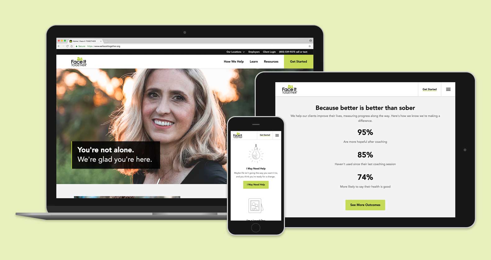
Making things bold.
With the underlying blueprints built and a handful of integrations pending, we dove into refreshing Face It TOGETHER’s web presence.
Design was repurposed to keep much of the same general branding — logos, colors, and all of the messaging that communicates Face It Together’s dedication to groundbreaking addiction treatment — all while shifting the focus toward a bold new avenue of discovery.
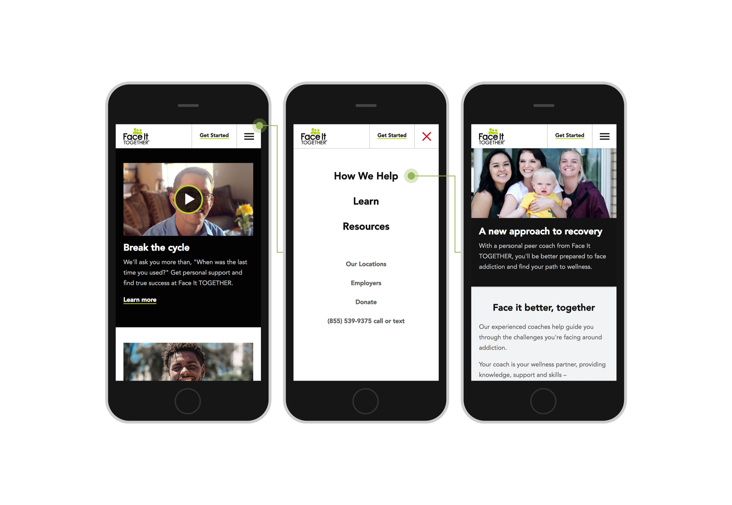
Bold is the keyword here: design was focused on consolidating pages into a tighter and faster sell, where visitors from the three main audience groups (those who feel they may need help, loved ones of those who need help, and employers) are able to quickly move through the site based on visual cues and simple calls to action.
And this is just the first phase. Our partnership with Face It TOGETHER will continue to unfold with a new data collection page, integration with their client resource management tools, and a dedication to serving both the addiction community through thought-provoking research and their clients through human-centered addiction recovery.
Old friends, new CMS.
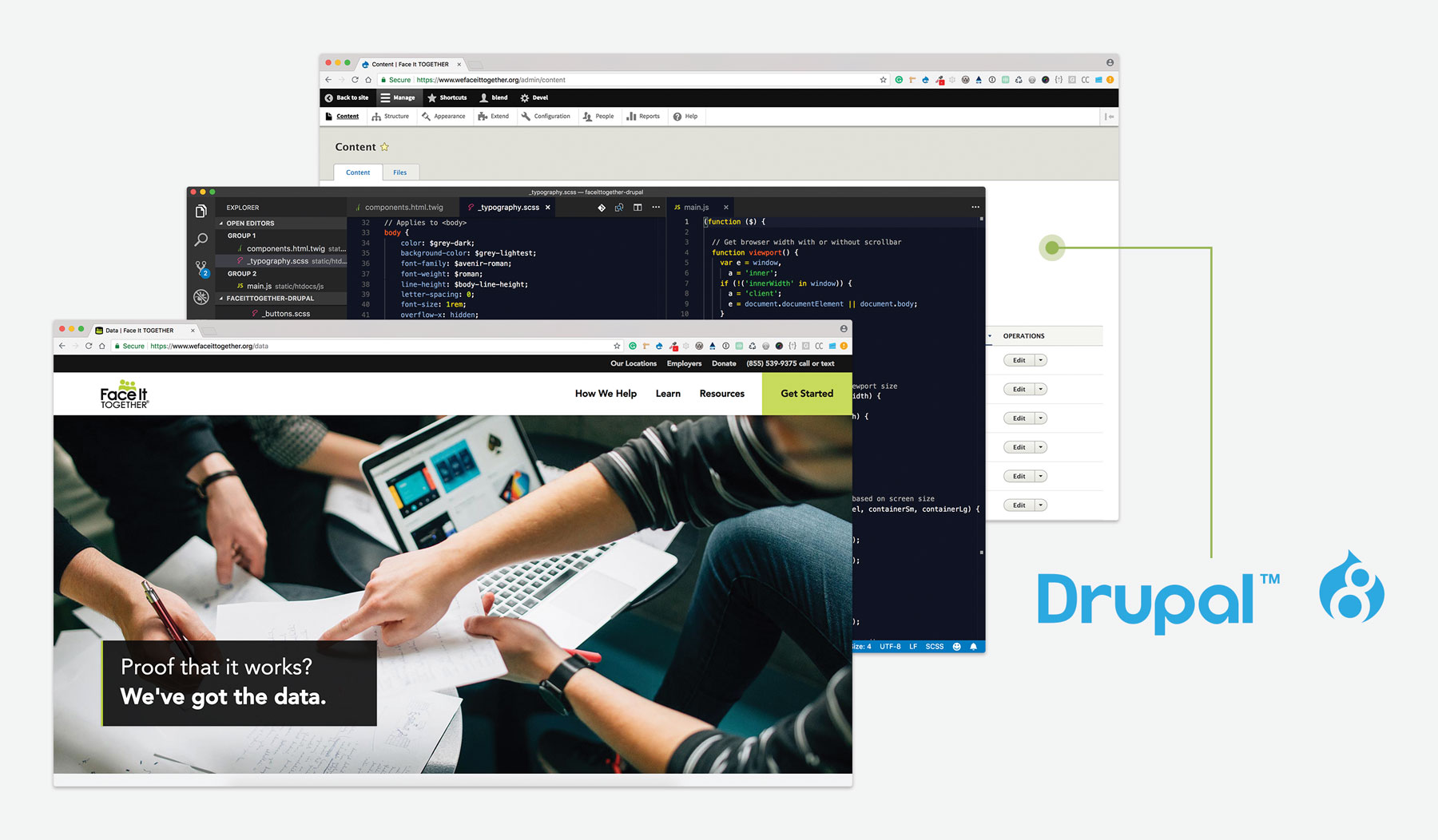
Finally, the new site was designed to fit a CMS that worked better with their distributed-yet-small marketing team. After developing the content model with a careful eye toward reuse and ease of publishing, it made perfect sense to move forward with Drupal, a CMS designed to juggle content pieces elegantly and with minimal editor frustration.
After choosing the CMS, we developed with two things in mind: creating new content types that would reflect the new direction of the Face It TOGETHER site, like unique location contact blocks and testimonial blocks that focused on real stories; and recreating existing content types that could handle content migrated in from the old site, such as general text pages and news articles like “Data Drops.”
They feel like minor changes — especially when paired with the challenges they face daily when working with people struggling to find their footing. But this kind of gradual design refresh, where things are constantly being reassessed and evaluated for effectiveness, is just the kind of mindset that keeps hope open for other kinds of gradual change, whether it’s for those suffering from addiction or the loved ones they affect every day.
It’s a little bit of help for an effort that’s literally changing lives.
Related work.
View strategy and design projects similar to this one.
Clean Design for an Important Community Resource
The main goal of design for Brookings Health System was clear: design with wayfinding in mind, just as you would in the hospital.

200+ Sites, All Customized and Accessible
One project, one major redesign, over 200 websites: how to use little updates to make big changes.