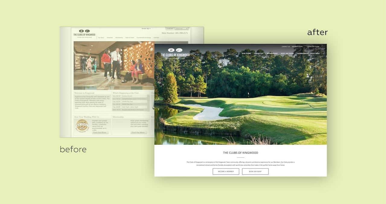
While initial wireframes and design dealt with providing templates for member clubs to choose from, both Blend and ClubCorp quickly realized that the best direction would be to rely on the current layout of a site to dictate the design, which means we expanded past the home page in designing a cleaner and easier to understand calendar, rearranged sidebars to flow more naturally, and dedicated the main view of the site to focus on the reasons you go to a club in first place: beautiful views, elegant meals, and a feeling that you can’t get anywhere else.
Working together with ClubCorp’s designers, we landed with a design that not only worked for the people working in ClubCorp offices, but also something that could easily be implemented by all of the member clubs.
Minimal migration, maximum impact
Implementation is one thing. Making the site real is another. Thankfully, the site focused largely on providing a new skin - an adaptable, accessible, and cleaner skin, for sure - on top of existing content, leaving ClubCorp member clubs with a much smaller pool of new content to create and maintain.
By adjusting the home page content type to rename several fields and add several more — and, by creating scripts that helped us understand when we might be overlooking obvious errors — we were able to develop the new interfaces to rearrange existing content without re-entering anything. This meant taking the two-sidebar layout and automatically migrating content into a single sidebar. This meant understanding homepage content and adjusting blocks based on which fields were already filled in. This even meant running a bit of trial and error testing to find the quirks in our code.
This all works because EZ Publish is unique in its ability to take a single site design and cascade it down throughout its children — even if there were 200 different site designs, with different logos, different navigation layouts, and even different club models. In real life, it meant those promoting the individual clubs needed only to write a few paragraphs of new introduction copy and the rest was already there. Minimal migration with a maximum impact.
A rising tide.
The new, modern design did more than just pull the prestige level up a few notches - it also prepared the site for the future with a fully responsive design and major accessibility updates.
This means that all of the work we did to make things cleaner, cooler, and faster, also made things more mobile-friendly, with a design accessible on all device widths. And, because the basic tenets of good design are also those that help maintain a more accessible web, the site is also better for those with disabilities. From wide-scale design updates to the little details, ClubCorp’s built with design - desktop, mobile, and totally accessible - mind.
In fact, here’s an example of a detail. Understanding that each individual club had custom logos, branding, and colors, we needed to provide a solution to a common accessibility issue: incorrect text contrast. WCAG 2.0 requires all text to be at a 1:4.5 ratio, but what happens when the site’s predetermined text color (white) didn’t work with your custom branding?
Instead of throwing the onus of understanding text contrast on the individual clubs, we simply baked it into EZ Publish itself. Whenever a promo block with a full-color background is presented, it defaults to a white text. However, we’re able to take the hex color of the block and programmatically measure the contrast - if it doesn’t add up according to the hex values provided, the CMS is smart enough to know it needs to be a darker color.
This isn’t just a cool bit of technology: it’s the first time something like this has been programmed into EZ Publish, which led developer Tyler Harms to release the code as open-source for future EZ Publish developers.
200 sites down, the future to go.
There’s a lot here, and that’s not even including the banner and pop-up additions, gallery updates, and even typography improvements and accessibility design. All of those things were gravy alongside the meat of the project: an overhaul that you can see, providing a point of pride for each individual club and a lot of relief for ClubCorp overall.