
Banking websites have to do two things well at once: give potential customers a clear picture of your products, and give existing customers the help they need. Here's how to approach both.
From the outside, we all know what we want from our bank. We want simple solutions for our hard-earned money and to feel like they have our best interests at heart.
Of course, from the inside, we know that banking isn’t quite that easy. Especially when it comes to communicating with those outside customers — the ones who need simplicity and peace of mind — through our website.
Potential and existing customers.
Like many other consumer-facing industries, a banking site must balance simple communication of a complex set of products while still providing detailed and comprehensive support to existing customers. All of this requires compliance with complex regulations. In other words, the makings of a real communication challenge.
At Blend, one of our core competencies is building websites for financial institutions. In fact, before Blend, one of my earlier jobs was at a bank managing their web team. Blend has implemented web solutions for several financial services companies in the past few years, and we learn something new each time.
When you're working with a banking site, you’re primarily addressing two audiences:
- Potential Customers: Those who need to get a feel for your bank, hoping they apply and become existing customers.
- Existing Customers: Those who need access to their accounts and help using and understanding their products.
Let's look at how these two groups can be approached.
Organizing content by audience, product, or task.
There tend to be three schools of thought on organizing content on a banking site:
- Audience-based taxonomy, dividing product information by key audiences. For example: Personal, Small Business, Commercial
- Product-based taxonomy, dividing products by their type. For example: Checking, Savings, Loans, Mortgages
- Task-based taxonomy, grouping content by “verb.” For example: Save, Spend, Borrow, Learn
Often, a banking site will choose one and rely on a second for further drill down: for example, audience-based that relies on product-based on the second level (e.g. Personal -> Checking or Savings)

Example one: a financial site that’s been organized by service offering.

Example two: a financial site that’s been organized by audience.

Example three: a financial site that’s been organized by task.
What’s interesting is that there is no correct answer. You can find top financial institutions using any of these models. Rather than an industry standard, your bank’s navigation model depends on your product portfolio and target customer. For example:
- Dividing by audience can lead to 'duplicate' pages, which can complicate search. For instance, your Personal and Business sections may both have a Checking page with different products. If you have a balanced share of business and personal customers with little product overlap, this might be worth the confusion, but if your customer count leans more to one side or the other, there might be better choices.
- Task-based taxonomies take the “banking” words out of the equation and focus users on what they're trying to do rather than how. But, this taxonomy comes at the cost of being specific: if your target audience leans towards inexperience, this may be helpful, but it’s probably frustrating to people who understand what CD’s, mortgages, and money markets are.
Any of these models can work, but because content often follows structure, deciding this model as early as possible is vital.
Providing product awareness.
When new customers visit the site, your goal is to provide them with information they will use to apply for an account. Often, a bank’s product offerings can be one of the most significant barriers to this process. As a user, how do I know if I need Simple Checking®, Reward Checking®, or Premiere Checking Platinum®?
While there are often no correct answers, the site should help the user quickly determine the best offering and then provide a concise way to understand the details and fee structures. This can be handled by simply describing the type of user the product is for, narrowing users' choices using a quiz, or organizing your products based on the target user.
As for understanding the details, the most common way is by providing a comparison chart, but these take a lot of work to get right! When you consider that most of your visitors are using mobile devices, you'll need to use some clever layout to allow users to compare products. You should also prioritize the items that are most important in the comparison.
Chase does an excellent job of getting this right. They include a comparison change that describes the products succinctly.
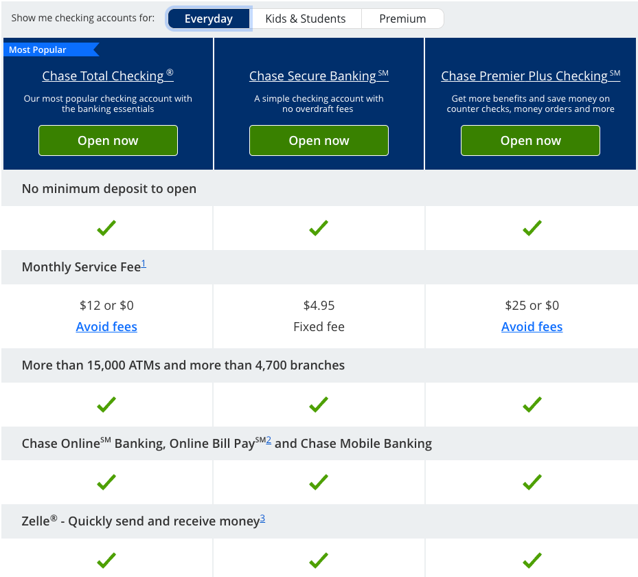
Chase’s site provides a comparison chart that allows users to easily compare products for different audiences.
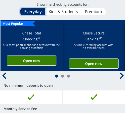
Additionally, at mobile widths, Chase’s comparison columns are easily navigated through scroll functionality.
Making things personal.
Given the wide variety of users arriving on your site, personalization can be beneficial in tuning your messaging for individual circumstances. As you understand more about the user, you can closely tie your website to your overall marketing strategy. Some examples include:
- Once a user clicks to log in to their account, they are flagged as an existing customer. This allows you to switch out some of the product information on the homepage to replace it with resource articles to promote key account features for retention.
- Using outbound campaigns targeted by demographic, you can use custom links to flag users by age. This would allow featured content areas of the site to vary between topics like building credit, buying a home, educating kids about saving, or planning for retirement.
- As users search for information about products they don't currently have (based on tags from outbound mailings or your account system), featured content areas can continue to raise those products on subsequent visits to keep them top-of-mind.
Keep improving.
Maintaining an effective banking web presence requires careful planning and continual improvement. While it’s tempting to think that a redesign will solve all our problems, plans — and the banking landscape as a whole — are always changing. It's essential to set up a process of continual review and improvement, which includes:
- gathering feedback from customers
- using A/B tests to optimize how to speak to our users
- reviewing the most common search terms to ensure we’re surfacing the best content
- reviewing analytics to understand better how users are navigating the site
As an organization, your position, approach, and messaging are unique to you and can help create customer loyalty. By starting with a flexible design system and continually improving your approach, you can continue to build that loyalty well into the future.