Using audits to drive change, Mechanics Bank launched with a new CMS and an improved design that follows web best practices. Find out how.
A Solution for the Provost's Office
How do we create and organize a university site that serves nearly everyone that the main site doesn’t?
Client
Building for the steps beyond “Apply Now.”
Potential students have all of the luck when it comes to a university website. It’s made with their needs in mind. Here’s the Apply Now button. There’s the Financial Aid section.
However, it’s not always so easy when you’re a member of the faculty looking for course approval, or if you’re a potential new employee looking for information on the university. How do you create a site that serves nearly everyone that the main site doesn’t?
A site for secondary audiences.
The Office of the Provost’s content didn’t fall within the traditional, tried, and true buckets we usually see on a university site, created with admissions and potential students in mind. Instead, the Office of the Provost focuses on a lot of administrative and governance content — their official positioning line is that “The Office of the Provost is responsible for ensuring a quality educational experience for students while providing support for new and existing faculty and actively engaging with our community.”
It’s not a small task — especially when the existing site is seen as the closest thing the University has to an extranet — providing administrative content to current and future faculty, students looking for on-campus resources, and connection points for the community.
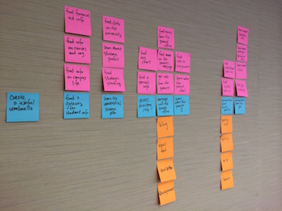
Through our discovery process, we also found a hidden goal that the site would need to serve: students simply didn’t understand the purpose of the Office of the Provost.

Building a better extranet.
Blend was tasked with creating a system that could both explain and facilitate the Office of the Provost’s everyday duties, while also providing a templated subsite for each individual department within the Office of the Provost. We took a large system of content and helped organize it into a functional cog within the University’s central nervous system.
The project was unique in that we had the freedom to wrangle complex content — from crucial FAQ sections to outdated session minutes — but we also had a very rigid structure to work within. This is the nature of a university department working with a larger university brand — you have some leeway, but it must be done within the structure of the University’s brand standards.
This made problem solving a little different than usual. We weren’t able to simply tear it down and start fresh. Instead, Blend worked with VCU to determine the best way to structure the site with their brand needs in mind.
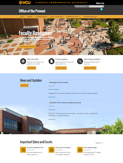
The result was a site that could live within the VCU brand, while still supporting it’s more specific purpose: facilitation of Provost content to make the university roll a little smoother.

Related work.
View higher education design projects similar to this one.
A Fresh Look for a Minnesota Institution
Updating the design for Minnesota State University Mankato in a way that didn’t remake the entire website.
Strategic Design for Development Handoff
Strategy and design for hand-off: our work developing a strategic design for an OmniUpdate university site.